[This blog post is Part 4 of 5 in the webpage improvement series “5 Key Concepts That Will Convert Your Webpage into a Sales Machine!”]
Goal: Get the visitor to complete your desired action.
Your call-to-action is the main goal of your sales page. Quite often, it’s the beginning of your customer’s journey to purchase your product. In other cases, CTAs can include text fields to capture email addresses and other types of form submissions that serve a wide variety of purposes.
Regardless of what your CTA is, you want it to be extremely prominent on your page so that your visitors’ eyes are drawn to it. If a customer doesn’t complete your call-to-action, you have failed your sales mission.
In this post we’ll take a look at how you can create the best CTA possible and implement it effectively to improve your conversion rate.
The colour needs to make your CTA pop while still fitting in with the overall look and feel of your website design. Avoid listening to the experts. Using colours that are the current “industry standard” are not necessarily going to work well for you. Every webpage performs differently and there is no one right answer. A/B testing is the only true way to find out what will work well for your webpage. If you don’t have the time or resources to conduct A/B tests, the least you can do is take a look at the designer’s colour wheel to help yourself choose a CTA colour that stands out nicely from the rest of your page elements.

www.wufoo.com
If your CTA goes out of sight during page scrolling, add it throughout your page and one more time at the bottom—rest assured, this is not overkill. One caveat to this point is that it doesn’t apply to multi-field forms. It would be a bit silly to implement the same form three times on the same webpage. Alternatively, you can place your form in a sidebar and make it float down the page as the visitor scrolls.
Only ask for the minimum required information. The more information you request from someone, the less likely they are to complete your form. Be mindful of the fact that people are busy (and lazy). They do not enjoy spending their valuable time giving you their personal information.
“Click here” and “Submit” are vague commands. Instead, tell people what benefit they’ll get by completing the action. “Get your [product] now” or “Subscribe to our Newsletter” are much better for improving click through rates (CTR).
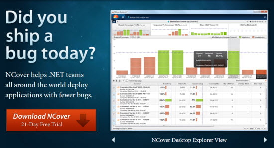
By using additional text near or under your CTAs, you can improve click through rates by relieving some of your customers’ doubts or fears.
For example: “100% guarantee” “Full money back guarantee on all purchases” “Free 30 day trial period”

www.ncover.com
When you introduce scarcity into the mix, people feel more pressure to make a decision. After all, it’s part of human nature not to want to miss out. Often this tactic will increase your click through rate and sales volume. When using a limited time offer, be very clear on the end date. Follow through by ending the offer at the said date. There’s nothing worse than a company who uses scammy promotion techniques to dupe people into purchasing time and time again. Eventually, such a tactic will come back to haunt you via negative publicity.
Sometimes people just aren’t ready to buy. Relax, there’s no way you will close everyone — that’s one thing I can guarantee. In this case, it’s a good idea to have an alternative CTA. Use it to guide customers further down the sales funnel without pushing them to make a purchase right away. It’s important to keep the connection going and allow the visitor to learn more about your product.
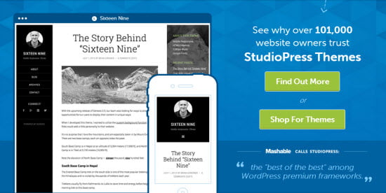
Including links to pages like “learn more” or “find out more” is a great way to provide quick access to additional information which will build further interest in your product offer.

www.studiopress.com
Now that you know the fundamentals of creating a solid call-to-action, you have to consider a few things before you go wild adding CTAs on your sales page:
Your sales page should have one focus in mind—getting people to complete your call-to-action. As such, it’s important to review your copywriting to ensure that it is building you reader’s interest, trust and desire. Without a well written sales page, your readers won’t be convinced in the value of your product. If they’re not convinced, they definitely won’t be completing your CTA. To make sure this doesn’t happen to you, ask yourself the following questions to identify if your copywriting is doing its job:
Visitors bounce quickly when they land on a webpage that is overcrowded and poorly designed. Before you spend time implementing CTAs, give your website a mini design audit to ensure that you are presenting information clearly. If your webpage is full of clutter, your CTAs will be ineffective. They’ll probably make your page look worse too.
Social proof is a great way to build trust in your product before asking a customer to “buy now”. Displaying the benefits and utility you’ve provided to past customers is one of the best ways you can increase your click through on CTA buttons and forms. Without social proof, your reader’s will be left wondering: “Does this really work?”
Now that you’ve got the design and copywriting fundamentals down to create a highly converting sales page, it’s time you got started building your masterpiece. Once it’s ready to go live, make sure you check out our final article in this series: A/B Testing Your Webpage For Sales Success which will be released next week.
If you want to catch up on the first three articles in our series “5 Key Concepts That Will Convert Your Webpage into a Sales Machine!”, you can find them below: