[This blog post is part 1 of 5 in the webpage improvement series “5 Key Concepts That Will Convert Your Webpage Into A Sales Machine!”]
Goal: Focus the reader’s eye on a few specific page elements that you want them to interact with.
When you’re selling online, your goal is to create webpages with the aim of showing off your company and products. Ultimately, you are trying to inform your readers about what your product is and convince them that they should make a purchase. It’s as simple as that. The tricky part comes in when you have a website that isn’t converting. If that’s the case, chances are you have a poorly constructed sales page.
The good news is that you’ve come to the right place. In this post, you’ll find 6 useful tips on how to structure the layout of your sales page so that your information is easily digestible. By displaying well structured information to your readers, you will gain the ability to harness their focus and direct it where you please. As you read the design tips below, consider how you can implement each one to improve the conversion rate on your website.
Often this key element will be your value proposition and other times it may be your call to action (CTA). Make this the focus of the page. If it’s not the first thing that jumps out at a visitor when they land on your webpage, then you’re doing something wrong. Rework your page design until your key element(s) stand out. Once you think you’ve got it right, start testing! We’ll talk more about testing webpages later on in this series.
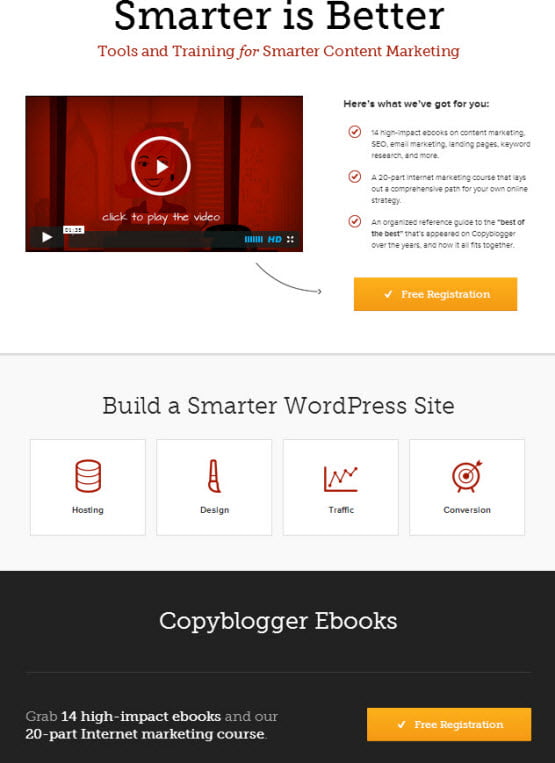
Using white space (or blank space) can make your webpage easier to read and ensure that your key page elements are easier to notice. There’s nothing worse than a webpage stuffed with a bunch of images, links and tiny text. Don’t make your visitors’ search for information—place it an easy-to-find spot so they see it in seconds.
www.urbotip.com
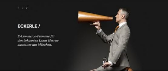
Single column designs are a great way to reduce the clutter of your webpage and focus the visitor’s eye on a narrow range of content. This design style allows you to hold the visitor’s hand and walk them through each and every page element you want them to see. The beauty of this layout is that your visitors have to follow the downward path of your page. There are no sidebars or random images to distract them from your mission. They see what you want, when you want. In this way, you will be much more successful at keeping their attention and convincing them that you’re product is worth the purchase.

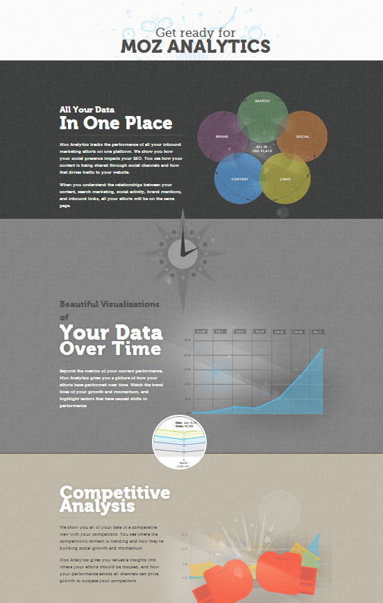
Content chunking is when you divide your page up into smaller visual chunks so it’s easier for people to digest. Often this is done using very distinct backgrounds or visual aids. Content chunking is a great way to make information easy to scan while keeping a smooth flow to your page layout. When used properly, this design technique makes content easier to find, thus allowing the visitor to spend less time looking for information and more time consuming it.
See moz.com’s product page below. They have created a beautiful easy-to-follow layout using the content chunking concept.

If you’re unfamiliar with the term design cues, they are simply a set of techniques used to focus the eye. In fact, I’ve mentioned a few already. They can be anything from bolding and shading to more direct cues such as arrows. Design cues are loved by marketers and consumers alike because they make everyone’s life easier. Marketers get the assurance that the viewer is seeing what they want them to see and the consumers don’t have to think about where to find the information they’re looking for. The visitor simply follows a set of arrows, bold letters, and other cues that direct him to the necessary information. It’s a true win-win for both parties. For a prime example on how effective arrows can be used in directing attention, see the Lean Start Up homepage by Eric Ries. Notice the way he has incorporated arrows to direct your attention through each of the sections as he explains his concept behind the book. For more information on useful design cues, see Oli Gardner’s post on Designing for Conversion.
 www.webdesignledger.com
I can’t stress this point enough. Do yourself a favour and keep your page design dead simple! The more things you cram on your webpage, the more distractions you’re adding. Why make a visitor play “Hide and Seek” with your CTA? How do you expect someone to find your CTA when they have to wade through tons of images, fine print and unnecessary copy? If a webpage is crammed full of information, all this does is make it harder for a visitor to find what they’re looking for. As a result, visitors will be less likely to complete your call to action (if they’re lucky enough to find it). Be minimalistic and thou shalt be rewarded.
So there you have it. Six solid tips you can use to improve your webpage today. Now that you have a solid foundation on which to start creating your sales pages, consider reading about the next step in the process: Writing a Headline and Sales Pitch That Will Boost Your Conversion Rate.